Grab Bag vol. 3
Things I found interesting lately, what I’ve been up to, and whatever else comes to mind.
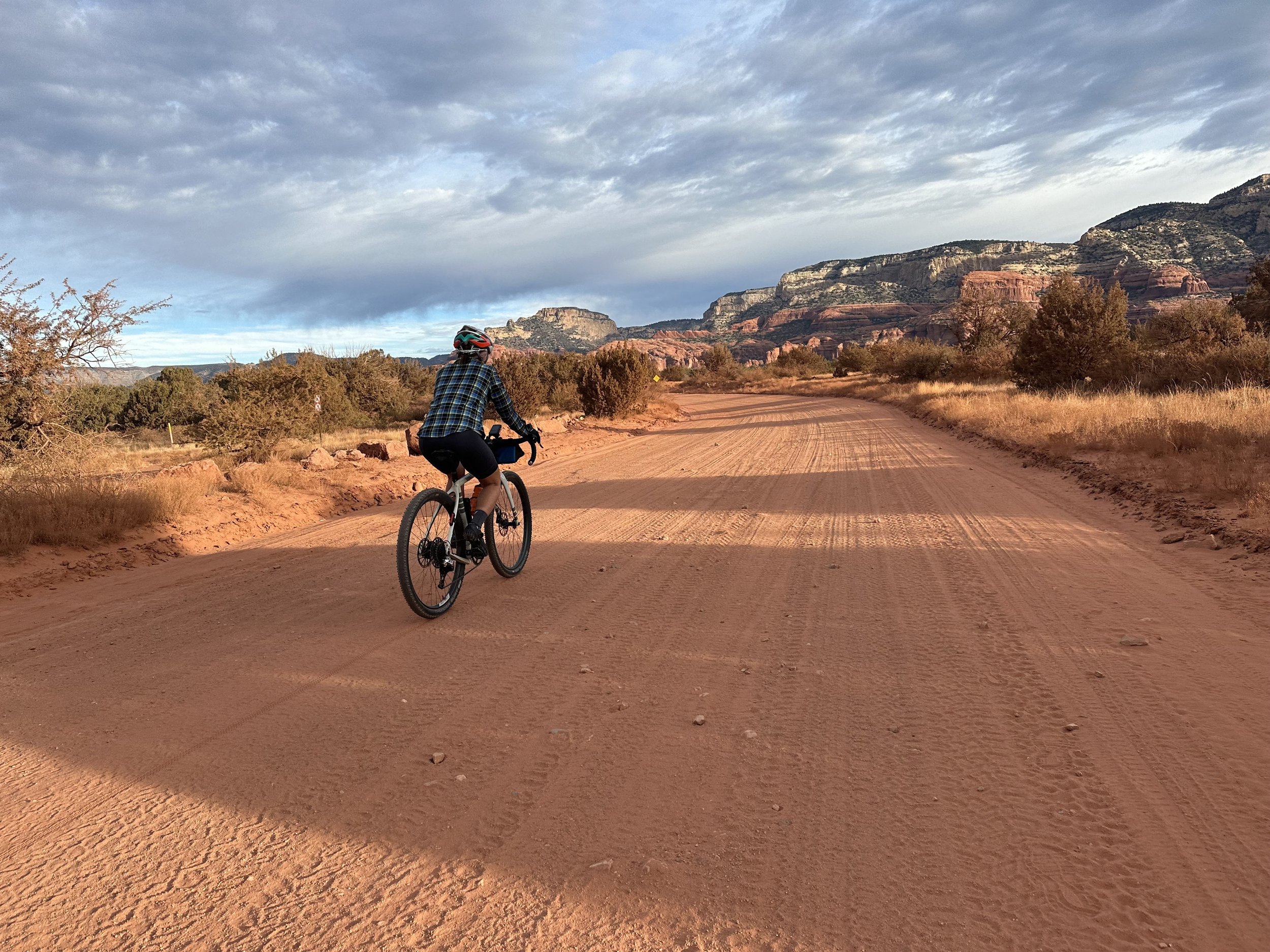
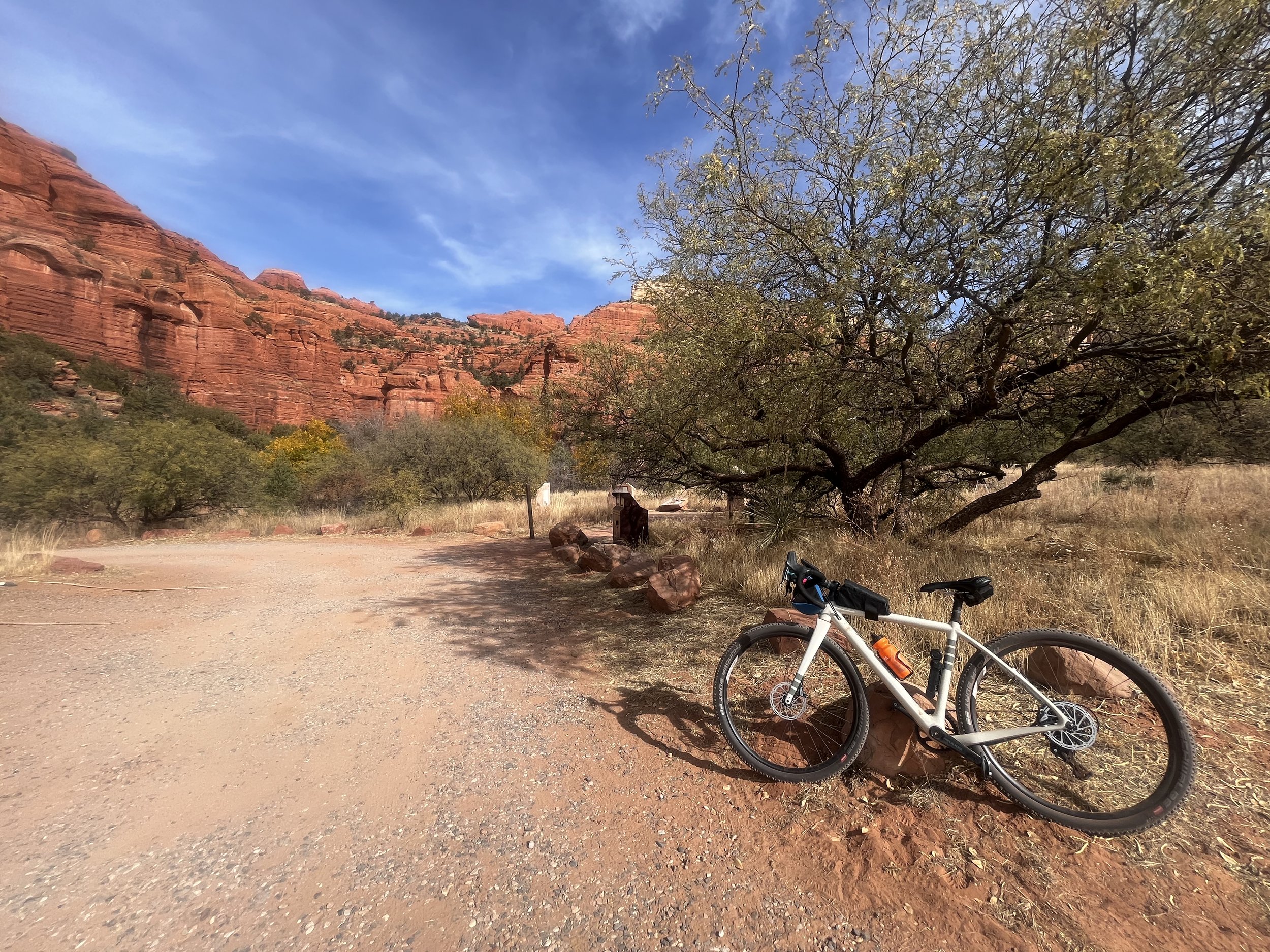
While in Sedona last month, Kit and I decided to do a gravel bike ride on some dirt roads to the Hononki and Palatki Heritage Sites. Kit loves visiting Heritage sites and thoroughly enjoyed visiting the dwellings and pictographs. I find it difficult to wrap my head around the time scale and age of these locations, and it’s baffling how people lived here for many generations. The scenery was stunning though, so I understand why they did! When we talked with the ranger at the pictograph site, he told us about a project that some archeologists were working on: they had fresh, new drawings in various colors on loose slabs and had left them out, lining the rock walls, to assess how the paint changed over a relatively short window of time. There is a fear that dust is damaging the pictographs at an increasing rate. This wouldn’t be particularly surprising to me, considering the “gravel” roads we took were more dusty sand-pit than anything else.
I don’t know how I feel about the concept of an “infinity drink” but I suppose I shouldn’t knock it until I’ve tried it (I haven’t….yet.)
We recently watched Spiderman: Across the Spiderverse. I generally do not like superhero movies, but I absolutely loved its precursor, Spiderman: Into the Spiderverse, so I wanted to give this one a try. It wasn’t quite as good as the first, but it still had phenomenal artwork and soundtrack. I’ve watched a few good breakdowns about the animation style and what makes it so special, but here is one short overview.
Relevant because of my recent blog post on photography: after attempting to write about it, I really wanted to revisit the course material from the online class I took on color. Conveniently, my friend also asked for a book on color and photography as a holiday present, so I got to spend some time researching other good material on the topic. More on some of these later, but I also stumbled across a nice refresher from another photographer.
I recently made some seemingly minor updates to my website, which turned out to be a colossal pain in the ass, as always (hopefully some things are noticeably better as a result?? Do tell. Weird UI experience? Also tell me…it’s a work in progress). About 5 years ago, I started this version on Squarespace, which has pros and cons. My very first website was really simple, so I was able to hand-code it, but it was lacking pizzazz. I didn’t really have enough web building skills to build something fancier from scratch, so I settled on Squarespace several years ago. Does it matter? Not really, but frankly I just enjoyed building this thing. I’m stubborn, though, and when I want things to be a specific way, I’ll work pretty hard to make it happen. One useful resource I found. Her templates look pretty fancy, and not something I’ve used or have tried to create, but I appreciate that she provides some education content as well.
Sedona Sunset
cheers,
April
Song of the Day: El Bueno Y El Malo by Hermanos Gutiérrez


